We see many different logo design trends fall in and out of fashion every year. And now, as we are halfway through the year, our team wants to show top logo trends for 2022 using examples of our portfolio that can inspire you.
Your logo is often the first recognizable element of your brand or business that people see, and a great logo is a key to making a good impression on potential clients or visitors. Keeping up with the latest trends will help you make your logo look up-to-date and relevant.
Ready for some logo inspiration? We found great logo designs from your portfolio to inspire you.
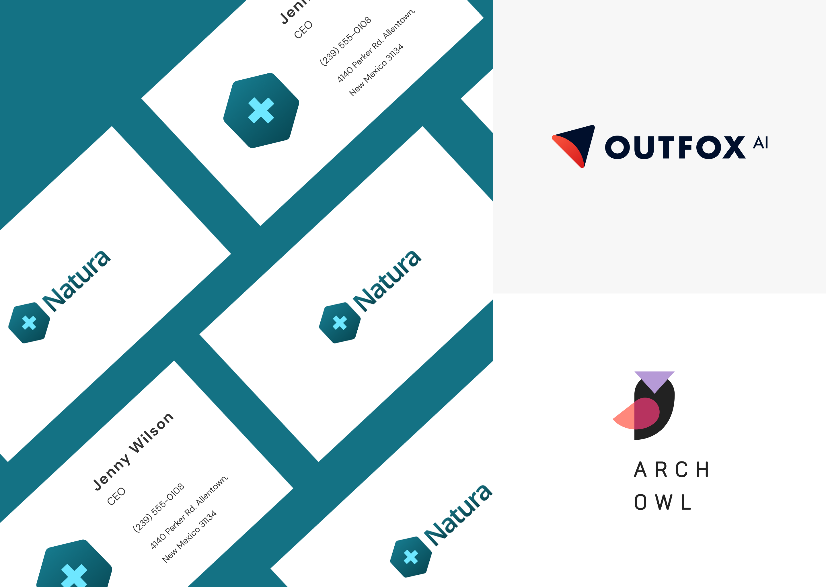
1. Simplification and minimal design
Logos are becoming simpler as the years go on. Designers are dropping intricate patterns and overly complicated fonts in designs. Because all businesses are online now, they increasingly use digital tools to communicate with their audiences. This new shift calls for simple and concise graphics. For example, sans serif font is among the easiest font sets to read online.
2. Gradients and 3D design
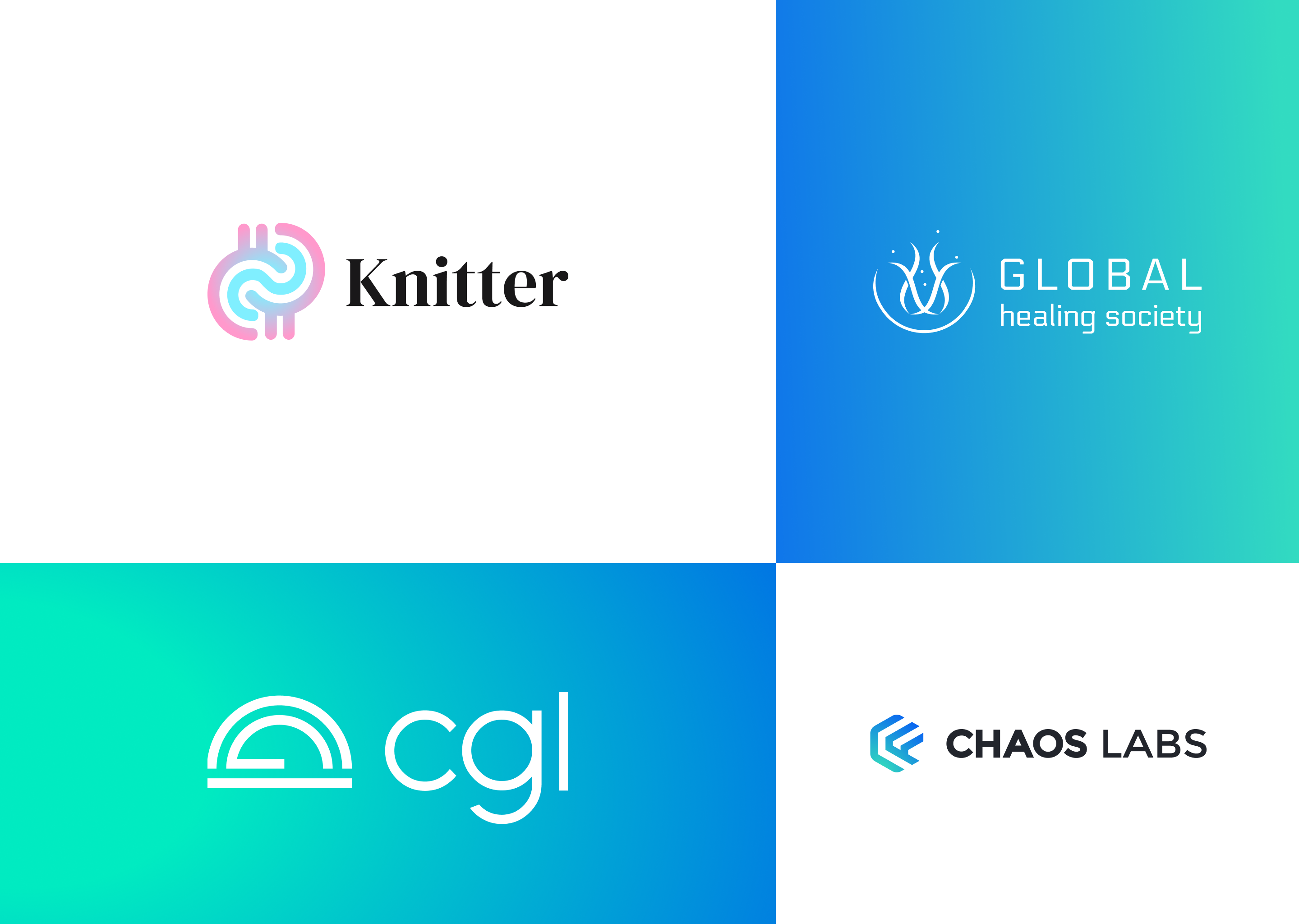
Gradients have already become boring since this is not a new logo trend. Nevertheless, such designs keep popular: designers use gradients in background images, website design, and logos.
A gradient is when the shades of the same color transition smoothly into one another. It gives the logo depth and volume, unlike a flat design.
And to help elevate your gradient logo, even more, how about trying a 3D design? Use the help of shadows and highlights to make your gradient pop.
3D gradient logos allow designers to play with colors and create unexpected solutions with a fresh and simple visual look. This trend also allows companies to stand out from the competition.
3. Negative space
Another trend is the use of negative space. Yes, you can say that this visual technique is not a new one, but this technique is still in demand and is one of the most sustainable in design.
Negative space is the “unused” space in a design, space inside or around a graphic element or letter.
Negative space logos can highlight your business’s creativity and ability to think outside the box. In addition, it can include hidden messages and images within the logo, which is a great way to engage customers and reel them in.
“White space is to be regarded as an active element, not a passive background.” – Jan Tschichold.
4. Optical illusion
One of the best ways to get people to look at your logo with curiosity is to use optical illusions. For example, try to use 3D effects, shifting shapes, changing or overlaying colors, and non-standard combinations. But do not forget that your logo should, first of all, convey your message to the audience.
Thanks to optical illusions, your logo can have volume and a wow effect that catches the eye. And this will significantly increase its recognition and memorability.
5. Unique fonts and typography that take shape
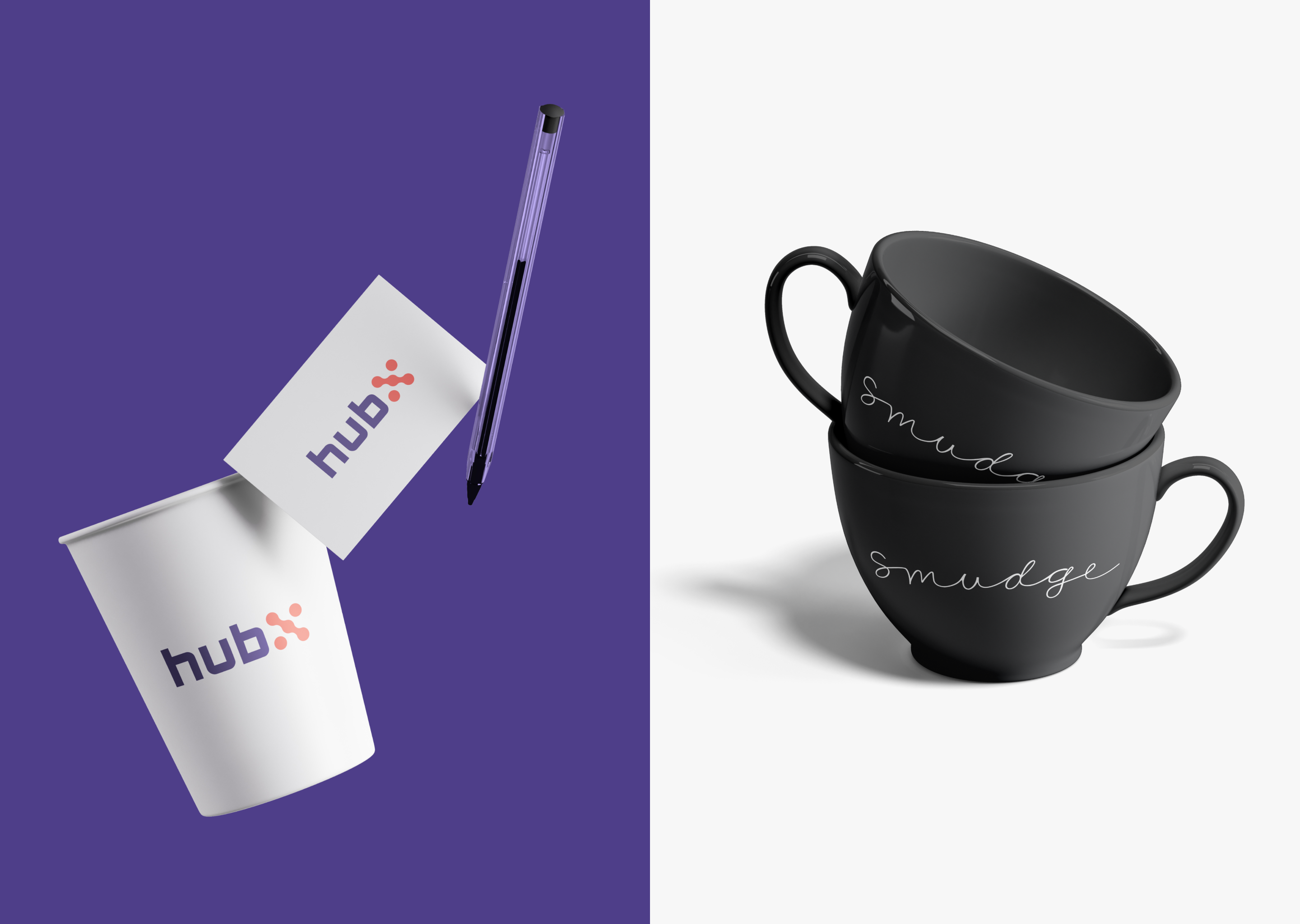
You probably noticed that wordmark logos are taking center stage in 2022, and the logos’ lettering can fully communicate brand personality. These logos come in two varieties: logos where the typography reigns in the imagery, providing an emblem-like shape for the logo, and logos where the typography is nestled within the imagery, providing it with structure and shape.
In such a situation, we need to find non-stardate and unique fonts to communicate brand personality.
To make the font unique, use the following techniques:
– Letter substitution
– Experimenting with resizing
– Perspective distortion
– Imitation of handwriting
In these logos, we see text and graphics working together in harmony.
6. Outline logos
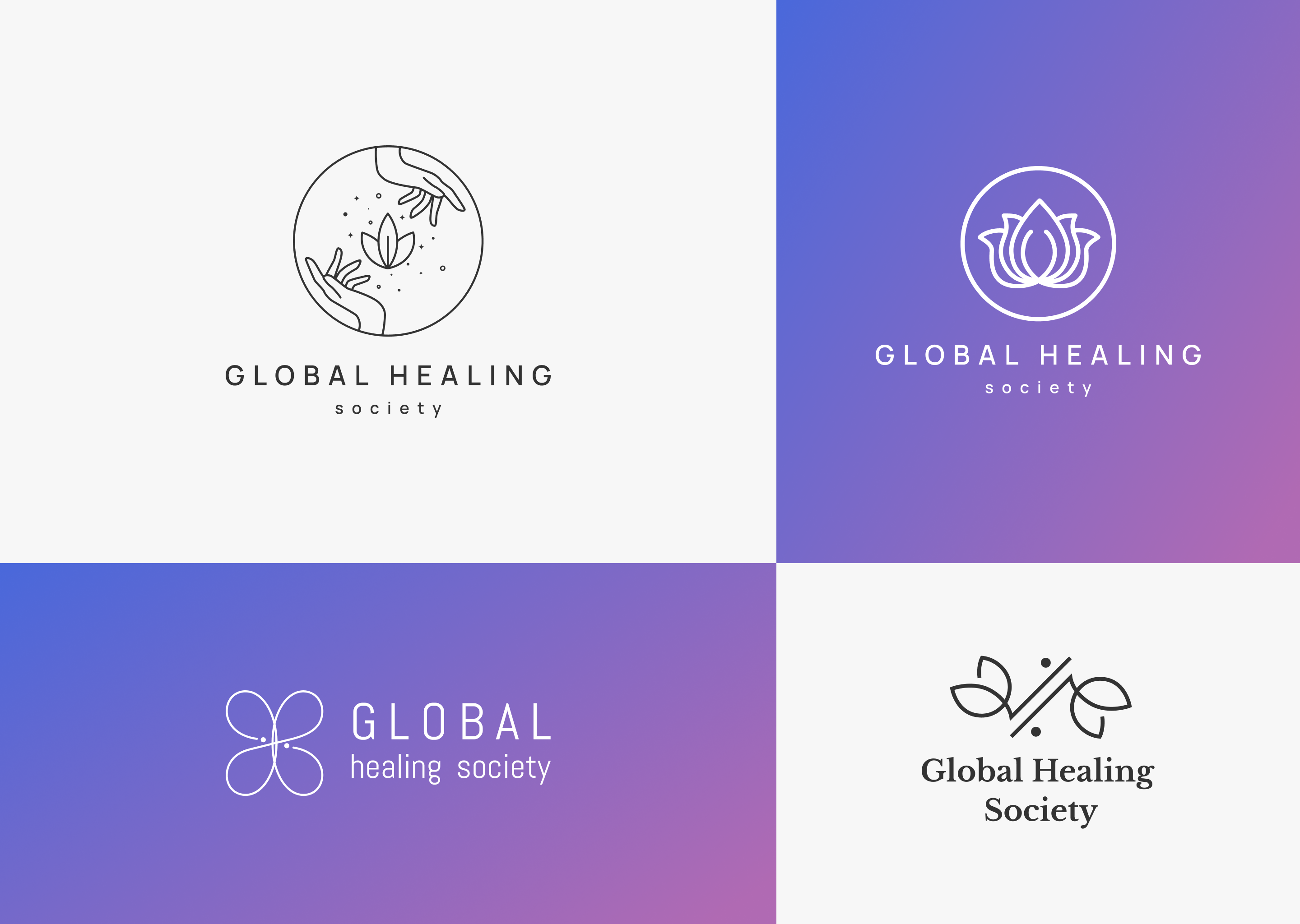
Outline style keeps getting more and more popular. Light and subtle, outline logos won’t overwhelm your design but will also help you emphasize its modern look.
Due to their simplicity, outline graphic elements are easier to animate, elegant, and suit a diverse range of design styles.
7. Classic black and white logos
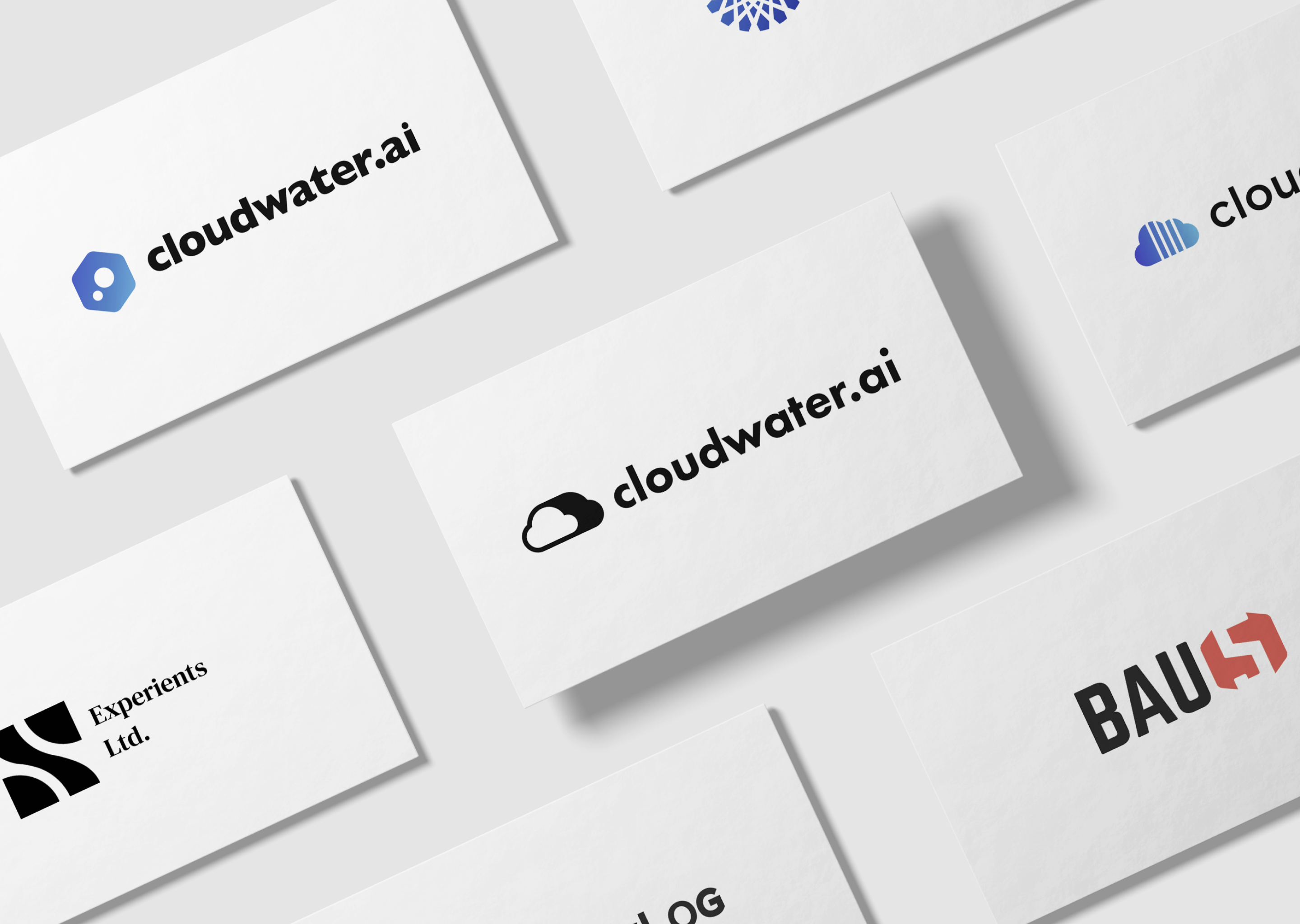
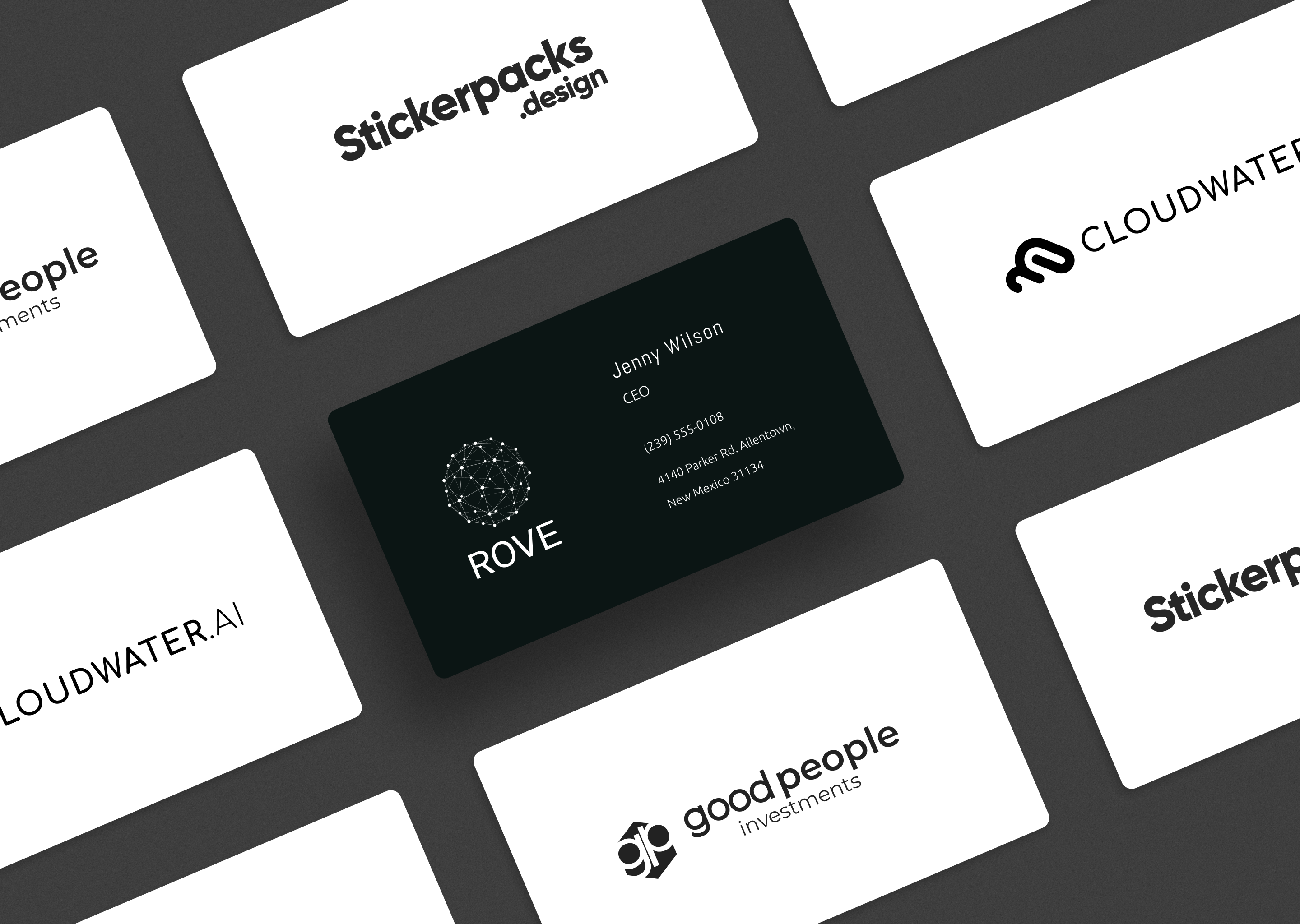
Well, a couple of words about the classics. First, black and white logos are timeless and always work, regardless of current trends and their influence on design.
Working on black and white logos, you always have the opportunity to be creative – you can change perspective, create a texture effect, add lines, shadows, and so on.
Building such logos, pay attention to details.
8. Lowercase logos
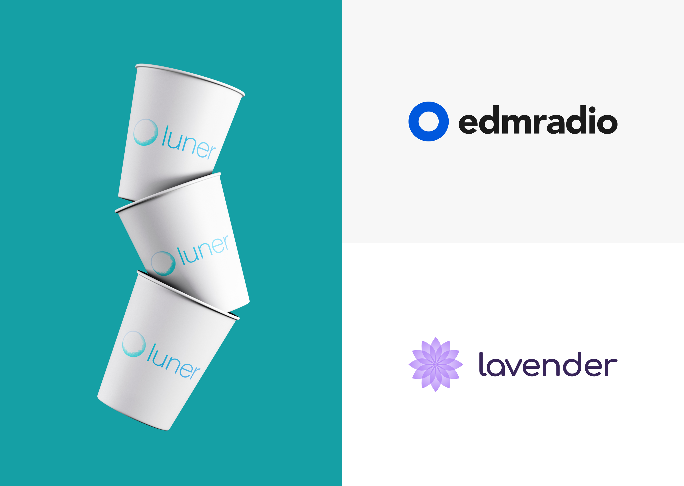
All lowercase letters fit together in visual harmony. Lowercase Logos are increasingly gaining popularity in logo design because such logos are friendly and approachable in contrast to all caps lettering that conveys authority and power.
Often, the written words in a logo must serve as a picture, a collection of shapes rather than an actual word following the rules of grammar.
9. Combined letters
Designers keep exploring geometric forms, fonts, and color blends to create classic logos—with a twist. So, in 2022 we see a rise to prominence in 2022 is logos with combined letters.
It feels free and aesthetic. The harmonious and stylish combination of letters can create the right brand image. But using this technique, finding the right style and letters to combine is essential. It can grab people’s attention and convey the brand message concisely and memorably.
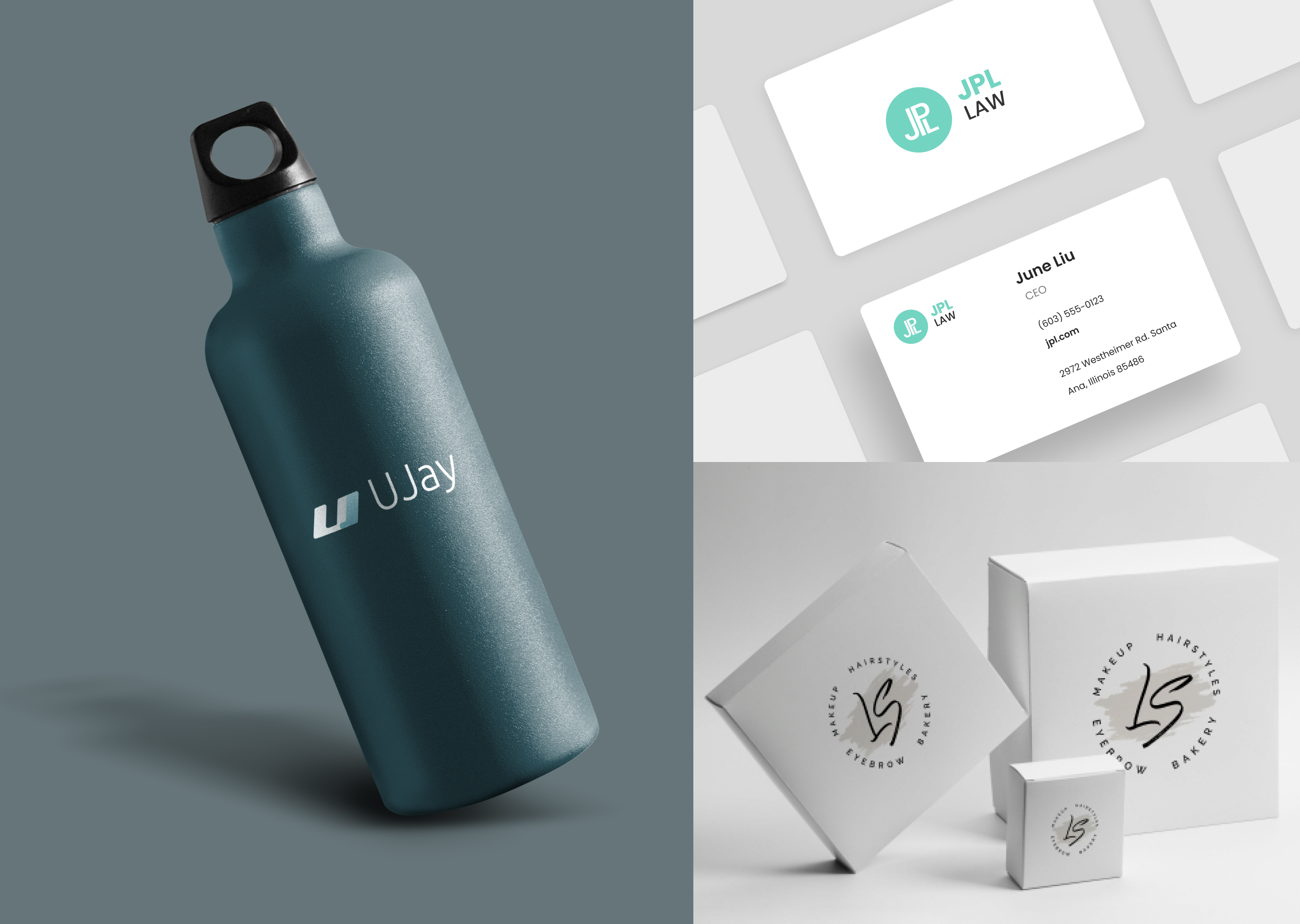
10. Monograms
Monograms are back, but in 2022 designers tend to enhance this strong technique with negative space, stacked elements, and bold geometry.
What’s interesting about a monogram logo design is its sentimental value — the use of letters forms memorable acronyms and a deeper connection to the company name.
With such excellent methods in your arsenal, you have all the chances to craft an excellent design.
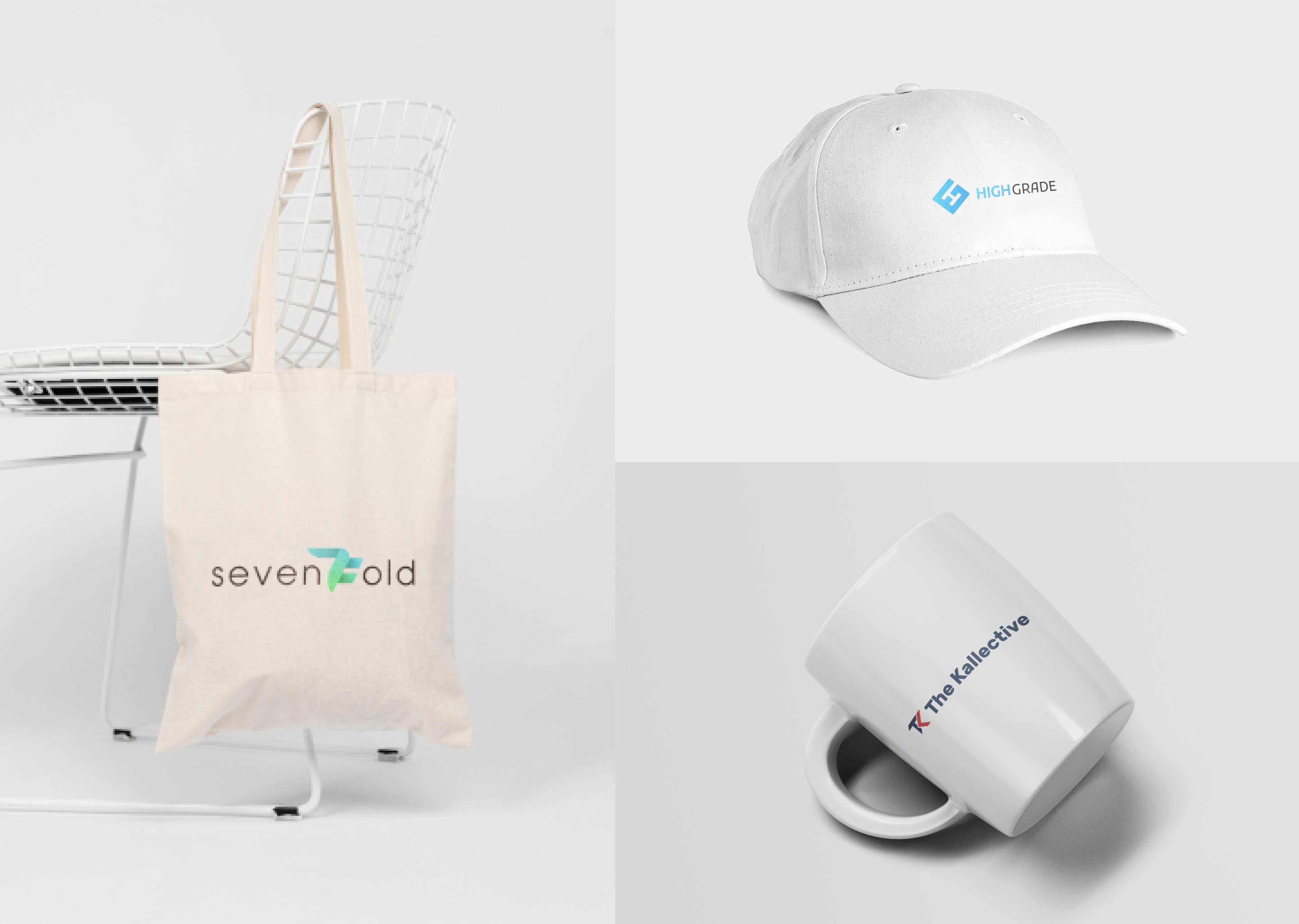
Logo Design Anti-Trends 2022:
The most important thing to remember is that it’s not the trend that’s bad, but the incorrect, thoughtless usage of it.
We encourage everyone to follow what’s cool and new, but stay critical! If something is popular, it doesn’t mean it’s good for your product or brand.
But, let’s see what trends losing popularity in 2022:
– Complex lettering. Complex lettering has been a trend in the past years. However, now there is a greater demand for simplicity and clarity.
– General complexity. Minimalism, minimalism and even more minimalism. It is what the audience needs now. Easy readability and memorability are important for a logo.
– Retro design. Surely there are brands for which this trend is still relevant. But such a trend would be great for a narrow audience.
Final Words
From gradients to an optical illusion, there are many exciting design trends to try on your logo and give it a fresh look for this year.
For Sweetcode Lab, the word logo design should always mean a unique design. It’s a part of corporate identity uniquely crafted for your business or personal brand. It communicates your brand’s value and professional quality.
Our team is ready to develop unique and trendy designs for your brand. In addition, we offer a unique logo design service – Express Logo Design.
Modern and incredible logos for your brand, done in literally a few days. Contact us via email at [email protected] or learn more about our services here.